Introduction
INTRODUCTION:
Bitfenix has become a household name that many in the enthusiast circles know well. From their unique use of Soft Touch material on chassis, to the cutting edge in mITX encloures. Today, on this fine Canadian morning we are looking at a new mid-tower offering. The Shadow.
With a market saturated in enclosures of all sizes, shapes and forms it becomes a difficult task to at times stand out or in this case to go un-noticed. Bitfenix it would seem has opted to design a case which in effect reflects the namesake it is given. To be a shadow, there and always present but unobtrusive. For many would be enthusiasts that is exactly what they desire. Lots of function packed into a simple, usable form. Lets hope Bitfenix is up to the task.
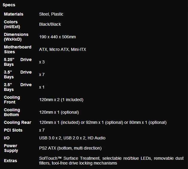
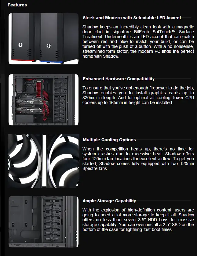
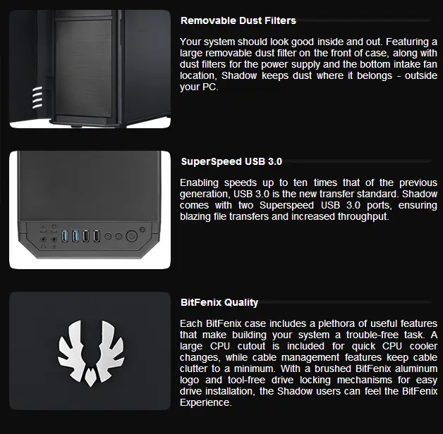
Manufacturers specs
Manufacturers specs
At a Glance
At a Glance:
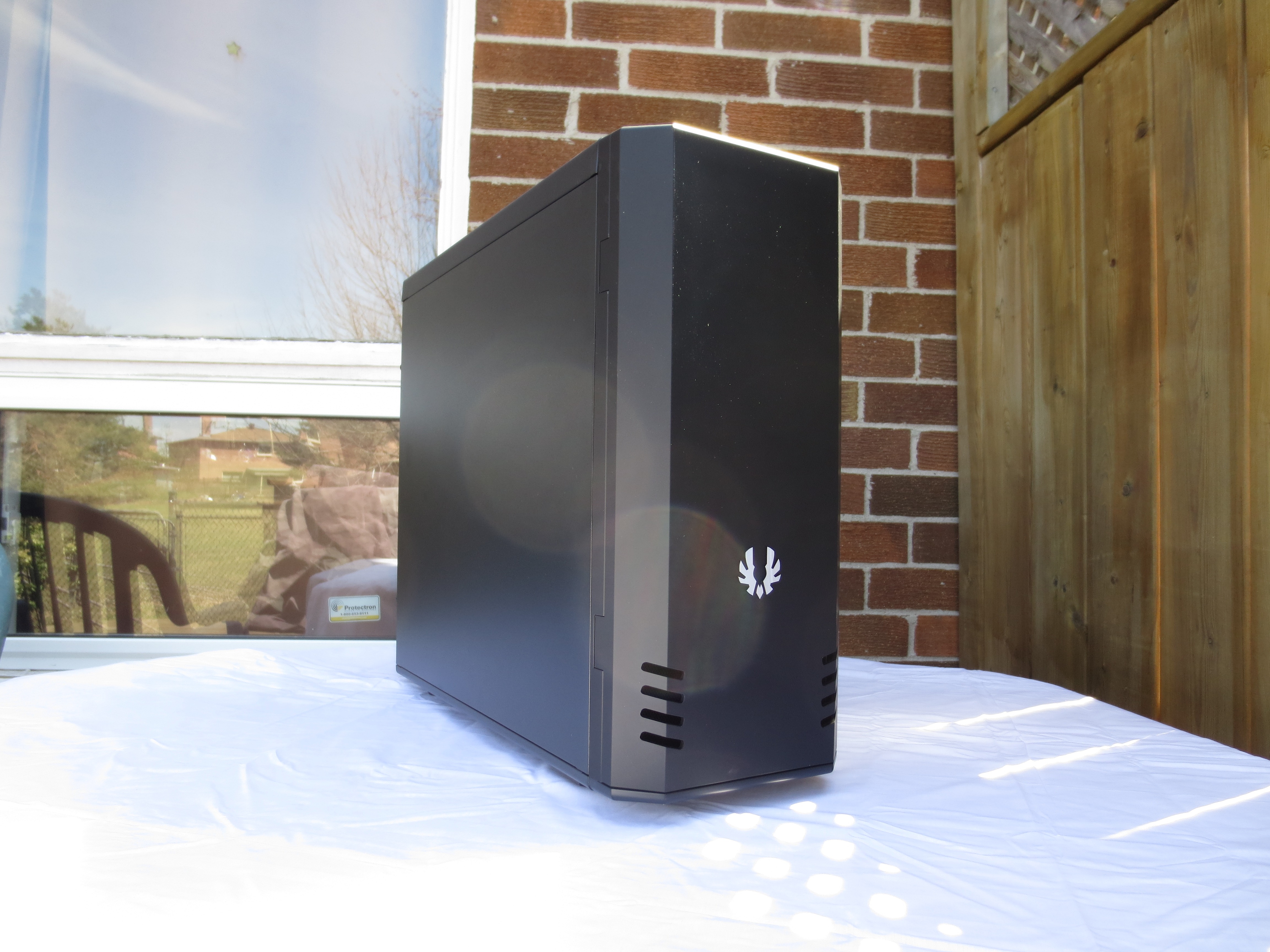
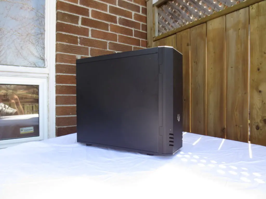
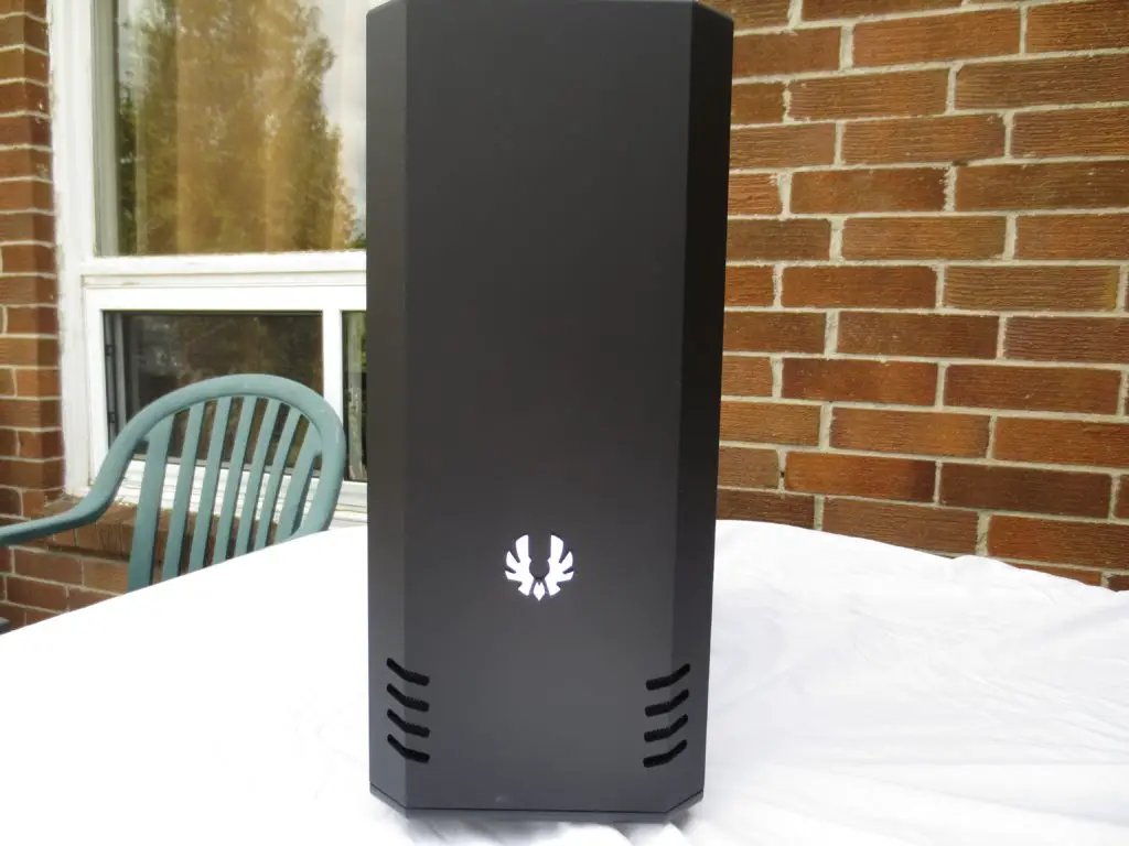
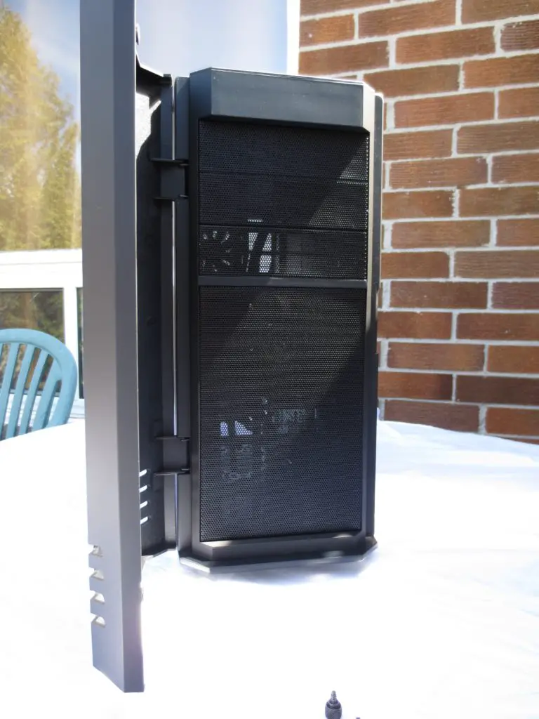
On the outside it is a simple fair. Both side panels are solid and streamlined into the case, and the frontal bays covered by a magnetic door treated once again with Bitfenix’s ‘Soft touch’ exterior.
Bitfenix has always impressed me in the use of this material, from their Colossus and Raider to this latest incarnation. It provides a very tactile and solid texture to what would otherwise be something that was merely plastic. As a secondary function , and one that is more than likely intentional by using this on the front door it makes it far easier to open. A nice touch indeed.
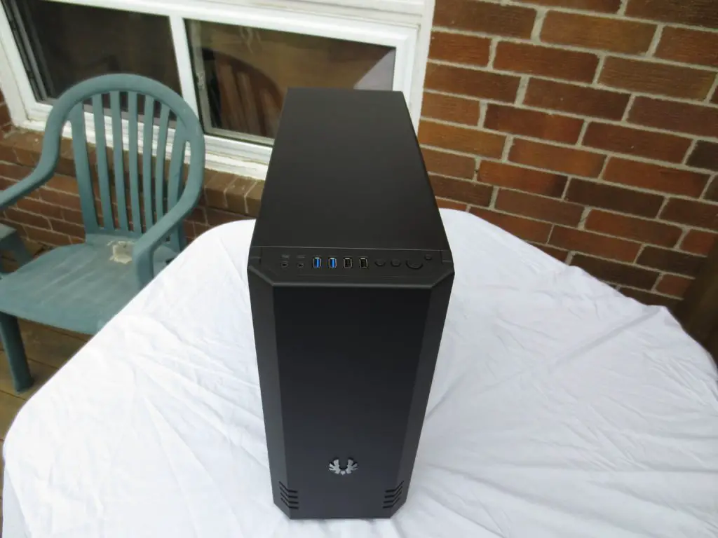
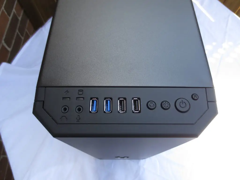
Connectivity is done through ports on the top, and given the position (top versus on either side) Bitfenix assumes that your case will be resting firmly on the floor below you. Going from left to right you have headphone and microphone ports, a pair of USB 3.0 ports and two of the more legacy USB 2.0 ports. In addition the top houses the controls for the one LED strip that is mounted below the front chassis door (allowing one to cycle from blue to red) and a power, reset button. For a case that is minimalistic in its composure it is nice to see the LED touch given for those of us who desire it, a little flair.
Inside the Dark Heart itself
Inside the Dark Heart itself
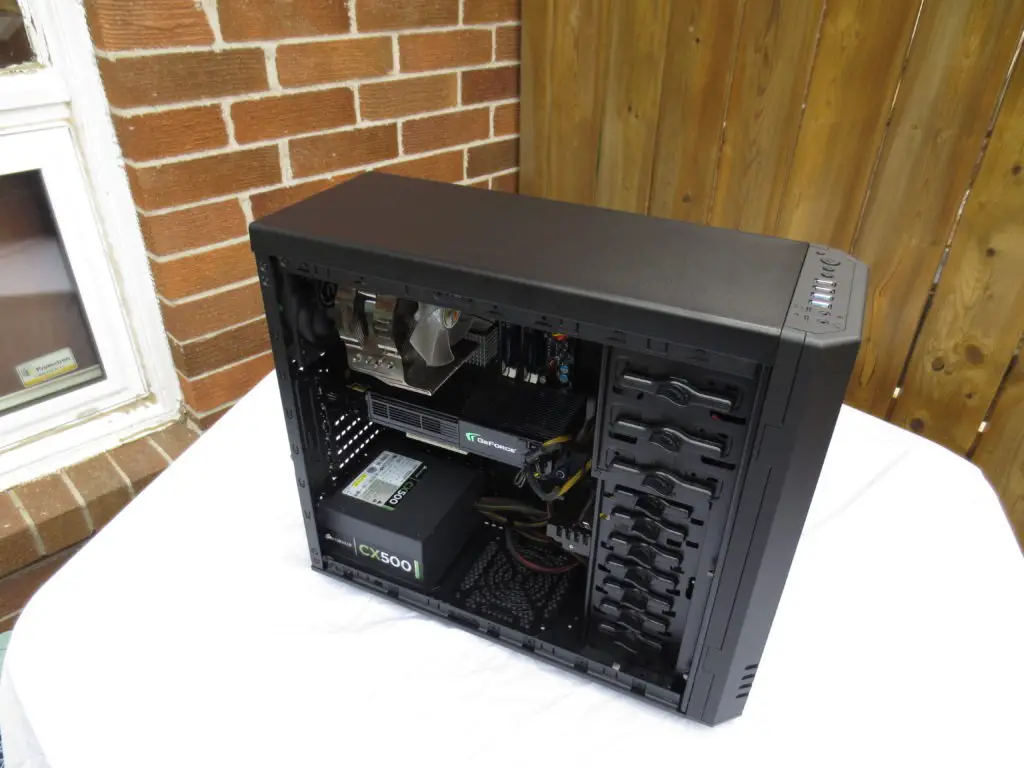
Now we will get a chance to see what rests at the heart of this Shadow and if it can steal the spotlight from other cases in its catagory. Upon actually starting to open up the case in preparation for the comming install, we find our first real problem. The side panels while solid and firm on the chassis, are very thin and easily flexed. And it doesn’t end with the side panels, the majority of the material that comprises of the core structure feels woefully flexible. It would be nice to see future ATX enclosures like this utilize more actual material. I would gladly have them omit the LED’s and controls for them if it means I will have a more rigid structure to work with.
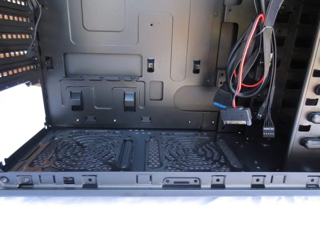
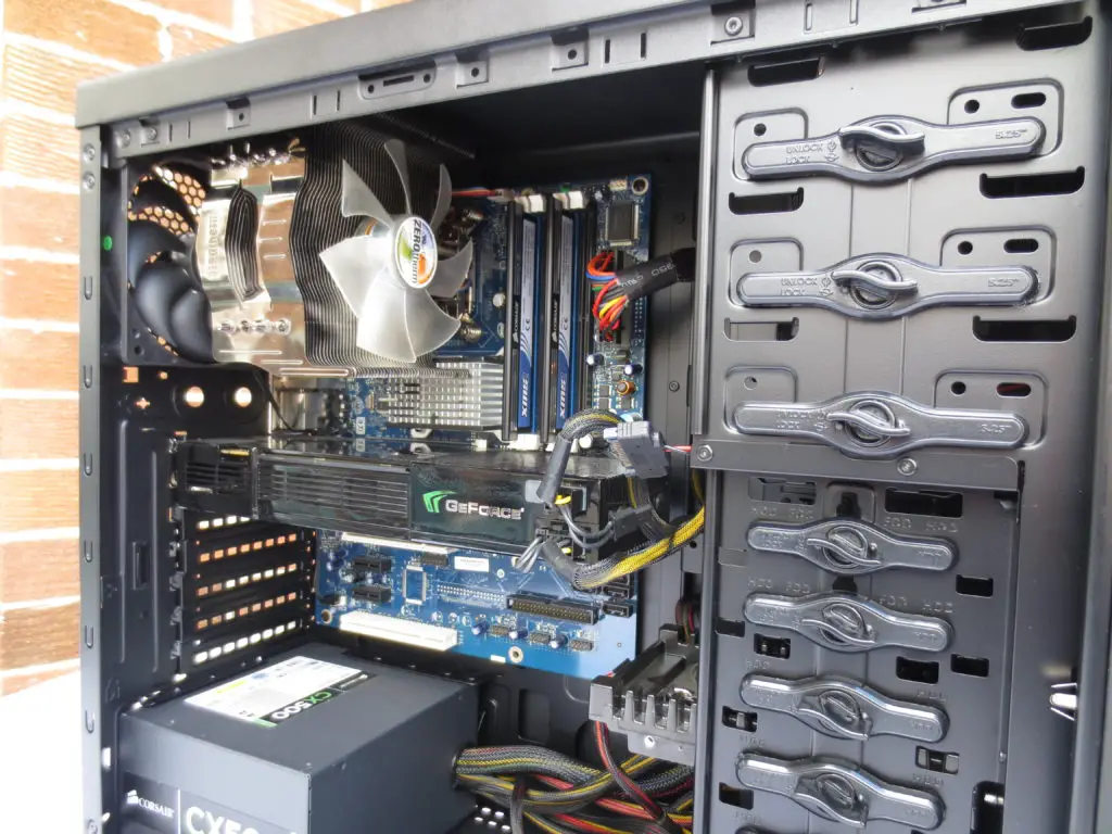
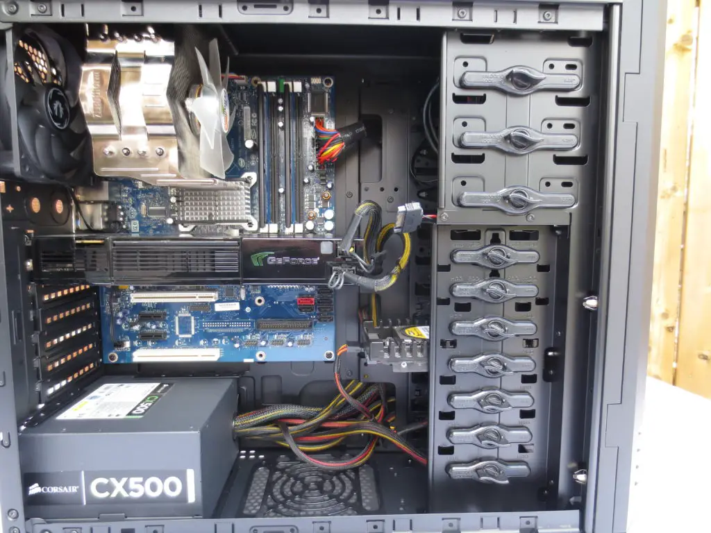
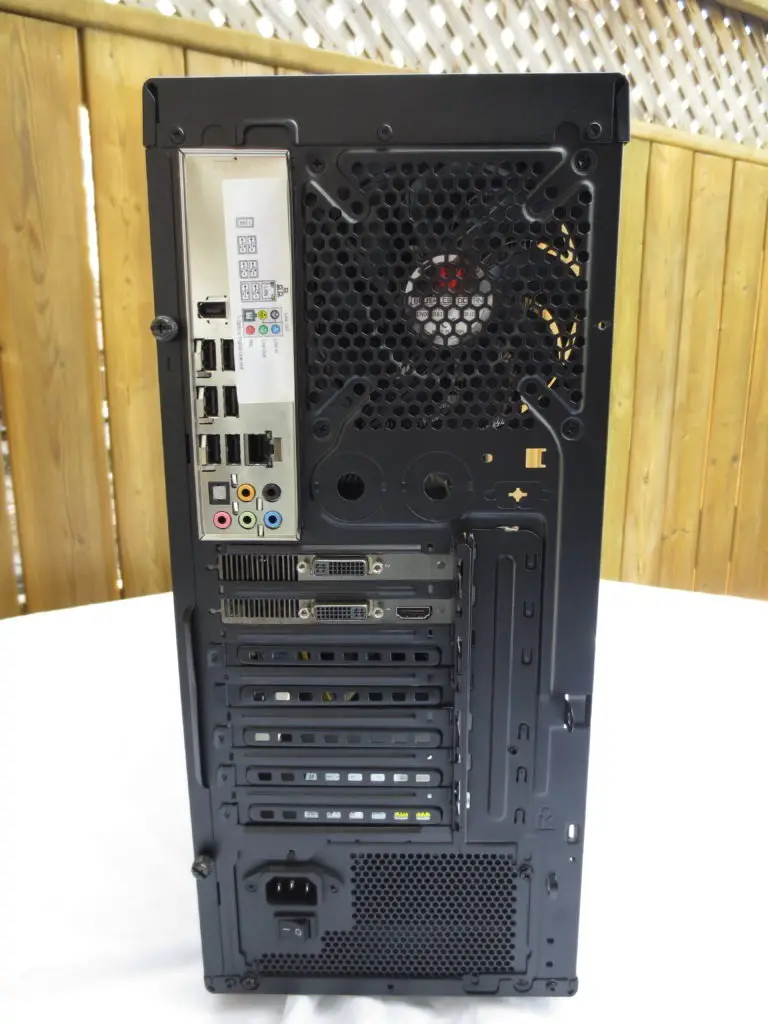
That small oversight notwithstanding, the rest of the internal design is well thought out. As is now tradition on almost all towers made today, the Power supply is given its spot to mount on the bottom. If you choose to use a smaller depth power supply , you can make use of an optional 120mm fan position both of which are treated to a fan filter. A nice touch indeed to help keep the internals as dust free as you can have them.
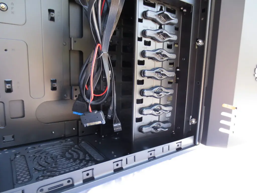
Bitfenix decided to have all hard drives mount flush instead of in a 90 degree fixture. This does help improve airflow substantially, and in my opinion it is the better way of doing things. Helping to cool the hard drives, Bitfenix gives us one of their famed Spectre fans with the ability to mount an additional one up front should you so choose. And much like the other intake ports these too are covered with dust filtration. Just enough to keep the bigger particles out , but not so thick as to impede airflow. I think they have a perfect balance with this choice.
Installation
Installation
With openings all along the leading edge of the motherboard tray we are given ample oppertunity to help route the cables as we need. However unlike many contemporary cases grommets are omitted around the openings. Luckily the quality of the paint inside helps alleviate this issue.
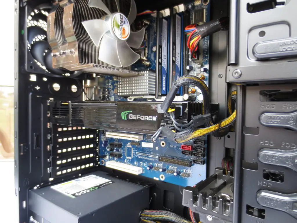
Again the general lack of rigidity in the material hampers installation, with anything more than moderate pressure flexing the case. And while the retention system for any discrete video cards is an older but proven design , it too suffers from how thin the material is , making it clumsy and awkard to work with.
The rest of the installation is very clean and straight foward. For cable management it would be nice to have some more depth behind the motherboard tray, it takes ingenuity when hiding cables but the reward is worth it. With the flush layout and ample holes provided we have a clean, airflow friendly final installation.
Conclusion
Conclusion
As I mentioned at the very beginning of this article the chassis market is diverse, where standing out takes a well thought out total package. I feel that Bitfenix has hit this mark in a unique way. By keeping the outside minimalistic they have strayed from many of the other manufacturers desire to litter the outside with excessive flair.
The case does have some faults which I hope they address in future designs, but it is very functional and one that lives up to its name in the corner of your gaming world. A Shadow.
Pros:
– Well designed for airflow
– Plenty of cable management holes
– Flush hard drive mounting
– Excellent dust filtration
– Sleek unobtrusive design
Cons:
– Depth for cable management is insufficent
– Thin side panels and chassis structure
– Obsolete discrete card retention system
